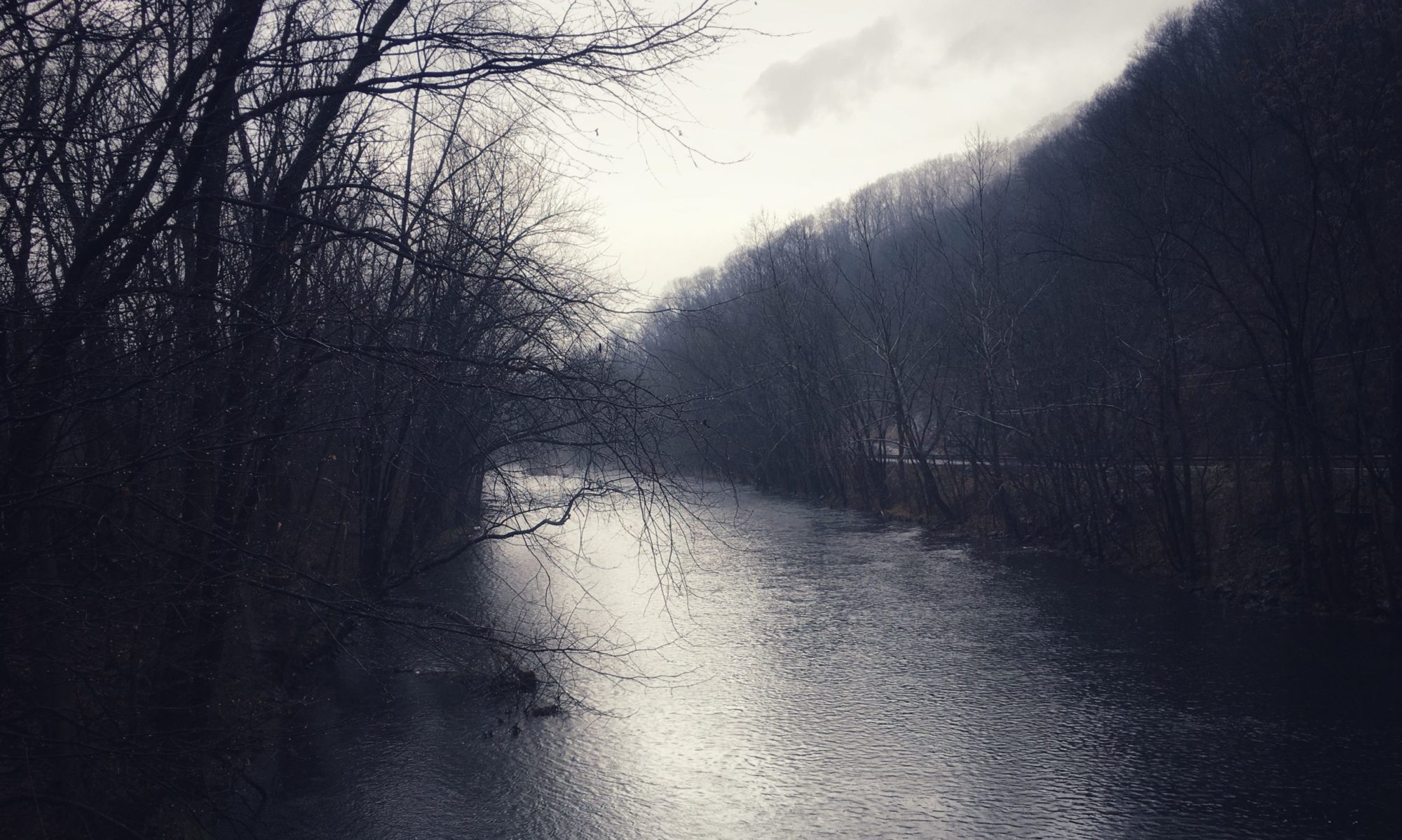
When Natalie d’Arbeloff changed the design of Blaugustine this past October, I left the following comment in praise of her new backdrop color:
Gray – oops, I mean grey – is always my favorite sartorial choice, though of course it doesn’t look good on everyone. Here, it definitely works for me – or maybe I’m just happy to see such a color-drenched blog vindicate my belief that grey need not be synonymous with drab. One can choose greyness as a worthy destination in its own right, not simply as some compromise between the extremes of black and white – which are in reality never “pure,” but must always contain some slight admixture of grey if we are to perceive them as other than blinding light and blind absence of light. In a certain sense, we might even be justified in saying that it is grey that approaches “purity”: pure pigment, cosmic dust, the gray matter/mater from which all else emerges.
Natalie replied,
I wholly agree. It is a beautiful colour in its own right and sets off the primaries wondrously. A grey sky, for instance, makes other colours luminous. And there is an infinite variety of greys.
“I don’t know about wearing it, though,” she added. “You’ve got to be tall.” Like a beech tree?
Black and white are always relative; it’s contrast that delights the eye. Or so my experiments with photography have led me to suppose. The following picture of an old, weathered stump of a black locust tree is the only one here actually taken under a gray sky. I think it has a little of that luminosity Natalie mentions – though again, the contrast with the yellow and brown of the background seems to play some role in bringing that out.
As Pennsylvania’s numerous fieldstone barns and houses serve to remind us, gray works well in architecture. Paper wasps (as in the first photo above) might agree. I see more and more wooden houses painted various shades of gray, too, and have flirted seriously with the idea of painting my own house that color (it’s currently white, matching the other buildings on the farm).
One reason I chose my current blog template was the presence of this very light gray behind the main text column.* In books, too, bleached white rarely looks as elegant as a page with some color in it. To be gray, it seems, is to be sturdy and full of years. I think there might be something to that metaphysics of gray that I cooked up on the spot back in October, when gray November still loomed ahead, and white snows made luminous by gray skies.
__________
*Refers to my old site.


